
Blenders Eyewear
Usability tests, then live A/B tests, for Blenders Eyewear
- Industry
- Apparel
- Services
- CRO, UX Design, Development

The Challenge
Blenders sells bright, bold sunglasses at prices most people can afford, and its online store is its main channel. Its conversion rate had slipped. Product pages were getting more views than the year before, but fewer shoppers were adding to cart.
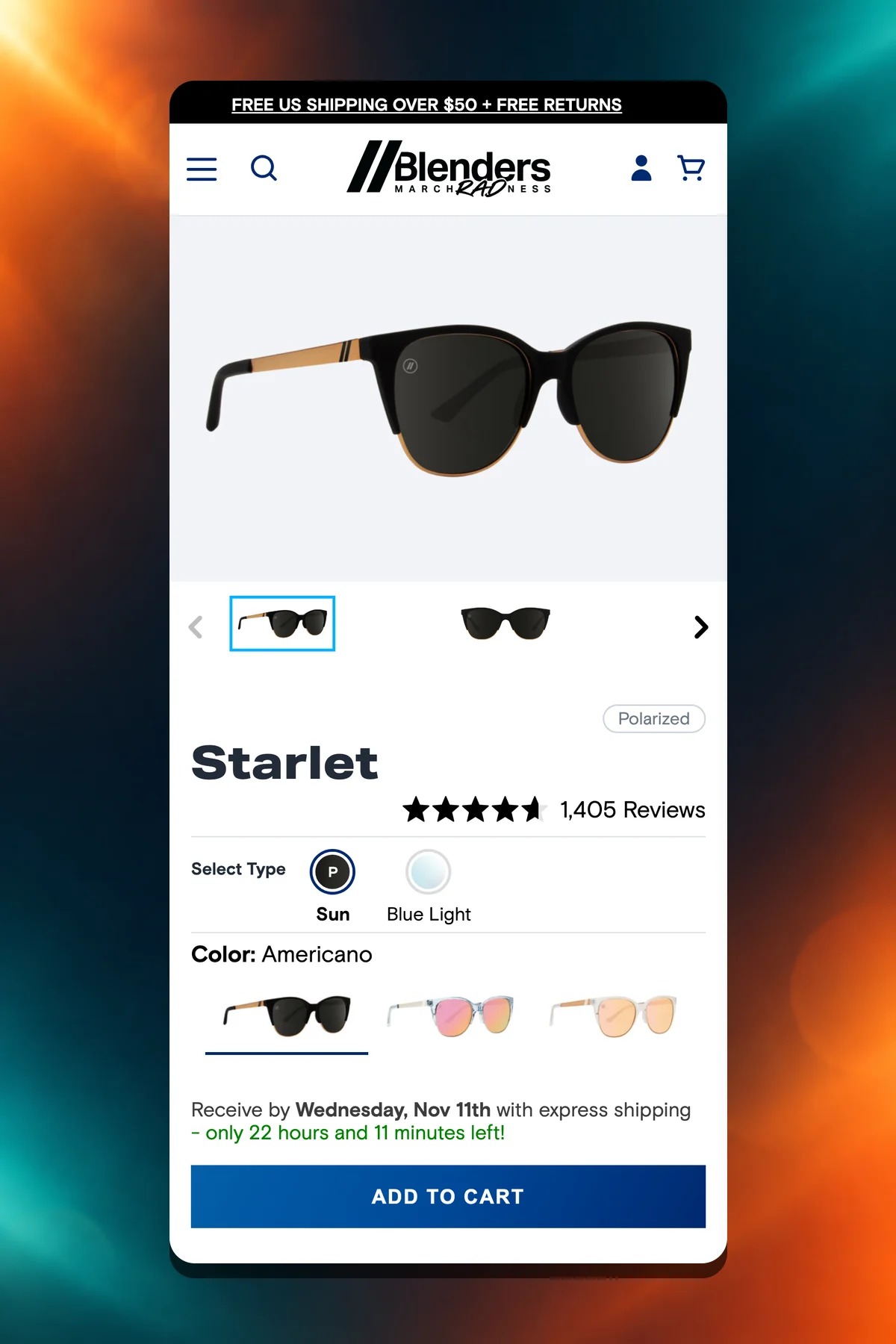
Blenders had also launched PureBlend, a new lens that costs more than its standard TAC lenses. The product page didn't explain the difference between TAC, PureBlend and polarized, so shoppers had to guess what they were paying for.
The Approach
DYODE spent the first month on a UX audit: an analytics review, a site audit scored for impact and effort, usability testing with real shoppers, personas and the paths they took through the store. The audit ended in a phased roadmap.
From there, each idea was designed in Figma, built on a preview theme as a pull request to Blenders' own GitHub repo, and tested in Figpii. Blenders' in-house team merged and published the winners. A monthly insights report tracked what each test showed.
What We Built
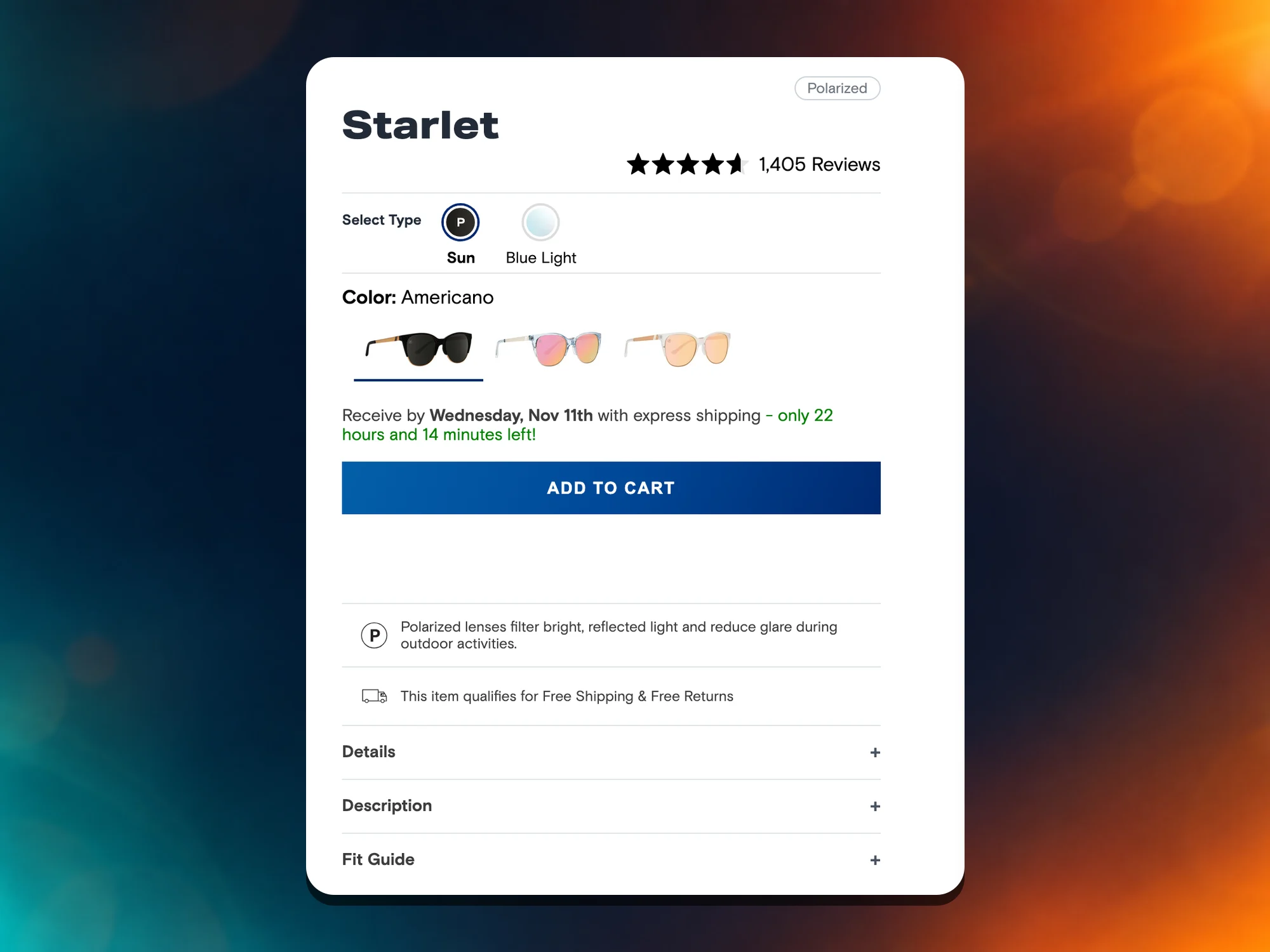
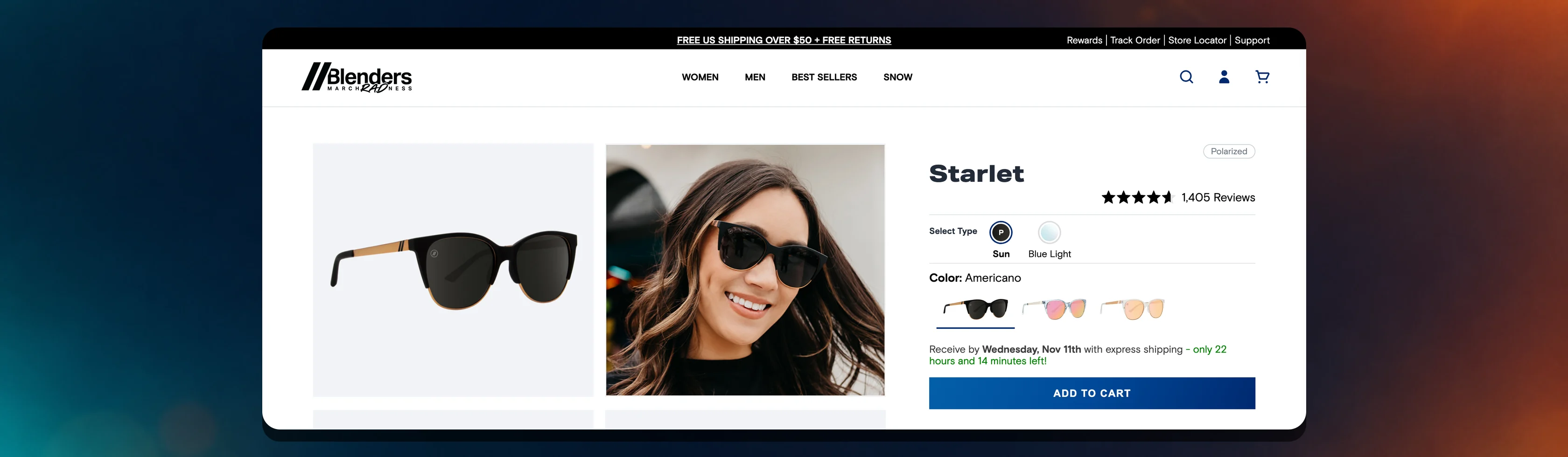
On product pages, DYODE added a feature-icon section driven by product metafields, so Blenders' team could switch each callout on or off per product. A pre-order block shows whether a batch is open, active or coming soon, with a modal for the details.
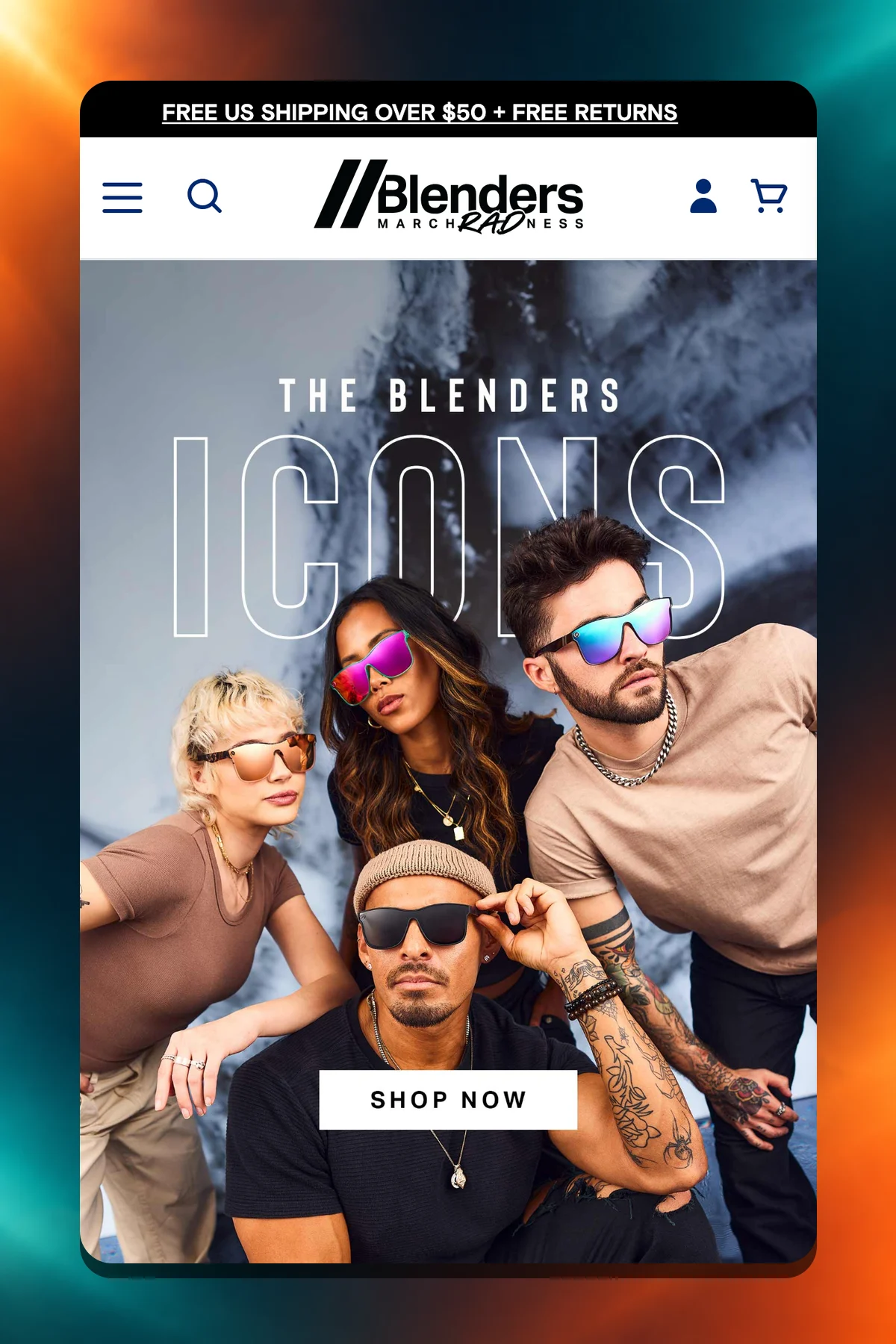
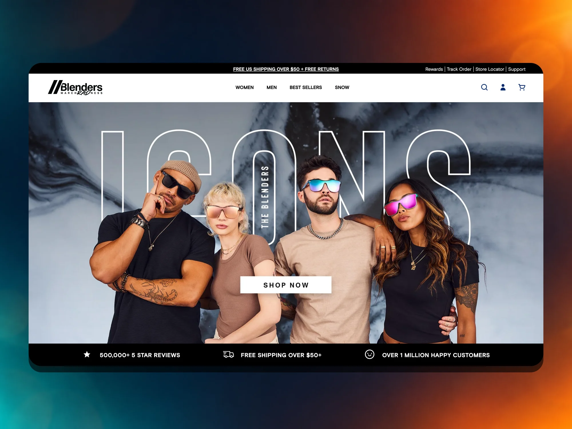
On mobile, DYODE fixed a bug that let product pages scroll sideways and cleaned up the free-shipping bar in the mini cart. On the homepage, DYODE ran a multivariate test of best sellers against trending styles, quick links and brand value props, then shipped the winning sections.
A lens test that lost, and what it taught
The first big test was a PureBlend explainer: a popup on an alternate product template, split evenly against the regular page on top sellers. Few shoppers opened it, and it didn't move conversion, so it was switched off.
The lesson was that lens information needed to live on the page, not behind a click. DYODE carried that into a product-page redesign with technology sections, alternating image and text blocks, accordions open above the fold and a sticky add-to-cart bar, tested across men's and women's styles.
The Results
Blenders got a usability audit with a phased roadmap, and a working loop for testing changes on its own theme: design, build on a preview theme, test, then publish.
The homepage led with the sections that won their test, and the losing PureBlend popup shaped the product-page redesign that followed it.
Services on this project

Tell us about your store
A strategist replies within 1–2 business days, and your written estimate usually follows in 1–2 weeks.
Most projects are scoped within 1–2 weeks.